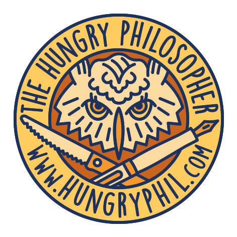
For the past few years this blog has been my space to play with tastes, images and thoughts that relate food, design and philosophy. You, my gracious readers, have endured the thematic restlessness between inauthentic recipes, food poems, food writing excerpts and random questioning. Still, sometimes I don’t know how to explain what this blog is about. So, I decided I needed to show it. Design to the rescue! I needed a visual representation of food, design and philosophy that was playful and somewhat irreverent (decidedly not authoritative). I whined and emailed my friend, graphic designer extraordinaire with a wicked sense of humor, David Wischer. Despite his busy schedule teaching graphic design at the University of Kentucky he came to my rescue. He sent me about 4 initial ideas (which he doesn’t want me to show because he thinks they are not good….sheesh…artists). I assure you, all were funny and well executed ideas. We decided to merge two of the ideas and worked through the color combinations to arrive at this angry, straining to think owl with a fountain pen and steak knife encased by the web address. I love it!
I hope you like it (and the new blog theme) as well. I’m working out the new look, so please forgive awkward moments the next few weeks.
Thinking through the logo design was helpful in focusing my obsession with complex connections between organic and inorganic consumption. What would your logo look like?
Find David Wischer and his work at:
http://finearts.uky.edu/faculty/art/david-wischer
instagram: @wischer
