Arts of Oliver Winery – Summer 2016

img_2710


DSC_0064.jpg
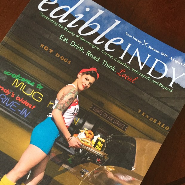
Check out my article in the summer issue of Edible Indy Magazine about Oliver Winery’s unique art labels. You don’t have to go to a museum for the best of local art!

Kevin Pope and Ken Bucklew are masters in painting the cultural and natural landscapes of Indiana. Conversations like these make such short pieces well worth the effort. Even if you don’t get a chance to read the article please look up their work. You’ll laugh, you’ll relax, most of all you’ll find Indiana to be much more interesting than corduroy corn fields (although that too is quite mesmerizing!)


Sam Kaplan builds with candy, cookies and gum

Photographer Sam Kaplan builds majestic architectural monuments out of small edibles. His work shows us the beauty and possibility in a stick of gum. Play with your food and find out what unusual art may be hidden on your plate.

For more images check out these Design Boom articles:

http://www.designboom.com/art/sam-kaplan-pits-pyramids-orgianized-food-art-09-18-2015/

sam kaplan forms sweet architectural arrangements with slices of gum

Pop-Tart Makeover

51LtV-nCyeL._SY498_BO1,204,203,200_.jpg

This recipe dedicated to my best friend and partner in food adventures and binges, Jim, is from Emilie Baltz’s fun and fantastic book: Junk Foodie: 51 Delicious Recipes for the Lowbrow gourmand.

We rarely buy Pop-Tarts, Jim’s childhood breakfast of choice. Photographer, designer, foodie, Emilie Baltz includes the Pop-Tart in the Junk Foodie Pantry along with Twinkies, Little Debbie treats, Animal crackers and more. She describes the confection as follows:

Introduced in 1964, The Pop-Tart name was inspired by the king of retro art movements, “Pop Art.” These toaster-ready breakfast treats were not only hip, but advanced. The packaging was adapted from a process normally used for dog food packing. Delicious.

Here is the recipe for Pop-Tart Brunch Strudel

1 Apple Pie Filling

1 Handi-Snacks Cheese Dip

1 Brown Sugar Cinnamon Pop- Tart Crust

Cut top off Apple Pie. Scoop out filling and place to side. Smear Hand-Snacks Cheese Dip on one side of reserved Brown Sugar Cinnamon Pop Tart crust. Top with apple pie filling. Cover with other half of Pop-Tart crust. Cut edges off to form a net rectangle shape. Serve.

Look up the website and book for 50 other recipes. The vivid and amazing images are very convincing and I almost want to try a few of the recipes. I am curious. The book is a beautiful exercise in re-imagining ingredients for someone raised without junk food (and a French mother).

Here is an image and review of pumpkin pie Pop-Tarts, from http://www.cookiemadness.net/2010/09/frosted-pumpkin-pie-pop-tarts/

pumpkinpiecrosssection.jpg

For those of you horrified by the above inventive, artificial, and industrial product  recipe, here are a few recipes for home-made pop-tarts

http://sallysbakingaddiction.com/2014/09/03/homemade-frosted-brown-sugar-cinnamon-pop-tarts/

http://smittenkitchen.com/blog/2010/04/homemade-pop-tarts/

http://www.cookingclassy.com/2014/05/homemade-pop-tarts/

Wishing you a wonderful Thanksgiving ahead whether your taste is lowbrow, highbrow or high-low home-made,

Hungryphil

The Abalone Bowl (Kostow-Mahon)

ceramics-christopher-kostow-bowl-620x699.jpg
The Abalone Bowl

I love the story of this bowl created in collaboration between Chef Christopher Kostow and artist Lynn Mahon. Here is the Bon Appetit article about the design of this dish that aims to look “like the bottom of the sea.”

Why veer away from the pristine  clarity of white porcelain that highlights the textures and colors of the crafted culinary delight? These collaborations between container and contained marks an investment in the emotive and atmospheric mood of eating. This design philosophy does not limit food to taste alone, like functional design. Instead it aspires to invoke a particular feeling, like art. In the case of the Abalone bowl, a sense of textured and fluid oceanic discovery.  It doesn’t flatly present the “geoduck course” (what is geoduck?) but becomes a participant, as the bowl’s clay has melted geoduck shells. For a better explanation, read the very short article by Belle Cushing.

It certainly makes me rethink the slow, artisanal, atmospheric, emotive and narrative role of updated “arts and crafts” tableware that invites collaboration between diner, ceramicist and chef.


http://www.saveur.com/article/Kitchen/10-Tabletop-Goods

http://www.bonappetit.com/entertaining-style/article/the-new-go-to-ceramic-tableware

Image from the Bon Appetit article: http://www.bonappetit.com/entertaining-style/trends-news/article/new-ceramics


Milk Carton History

95293-425x282-Milk_Bottles

I recently discovered the podcast Food: Non-Fiction where the hosts were discussing the history of the milk carton. Worth a listen if you ever wondered what happened to those wonderful glass milk bottles? Or, if you wondered why were there images of missing children on the paper cartons during the 1980s?

Here is a few interesting facts:

  1. The milk carton essentially developed along with the refrigerator. Its an example of one technology changing related objects. One, following Levi Bryant’s argument in Onto-cartography, could say that the gravity of the refrigerator mediated the shape of the milk carton.
  2. John Von Wormer developed and patented the carton in 1915. It took at least three decades for both the refrigerator and the milk carton to catch on.
  3. I wonder what prompts the gallon milk jugs? Thoughts?
  4. In the future, our refrigerators will be able to scan the bar codes and keep track when our milk spoils.

internet-of-things-5

LG Smart Refrigerator:  https://uxmag.com/articles/the-internet-of-things-and-the-mythical-smart-fridge

Other links:

http://www.foodnonfiction.com/2015/07/designing-milk-carton.html

http://www.theatlantic.com/national/archive/2012/08/the-surprising-history-of-the-milk-carton/260587/

http://www.ideafinder.com/history/inventions/milkcarton.htm

image from http://antiques.lovetoknow.com/Antique_Milk_Bottles

Visualizing Hungryphil: An Exercise of Food and Design

For the past few years this blog has been my space to play with tastes, images and thoughts that relate food, design and philosophy. You, my gracious readers, have endured the thematic restlessness between inauthentic recipes, food poems, food writing excerpts and random questioning. Still, sometimes I don’t know how to explain what this blog is about. So, I decided I needed to show it. Design to the rescue! I needed a visual representation of food, design and philosophy that was playful and somewhat irreverent (decidedly not authoritative). I whined and emailed my friend, graphic designer extraordinaire with a wicked sense of humor, David Wischer. Despite  his busy schedule teaching graphic design at the University of Kentucky he came to my rescue. He sent me about 4 initial ideas (which he doesn’t want me to show because he thinks they are not good….sheesh…artists). I assure you, all were funny and well executed ideas. We decided to merge two of the ideas and worked through the color combinations to arrive at this angry, straining to think owl with a fountain pen and steak knife encased by the web address. I love it!

BanuLisaColorSticker

I hope you like it (and the new blog theme) as well. I’m working out the new look, so please forgive awkward moments the next few weeks.

Thinking through the logo design was helpful in focusing my obsession with complex connections between organic and inorganic consumption.  What would your logo look like?

Find David Wischer and his work at:

http://finearts.uky.edu/faculty/art/david-wischer

http://www.davidwischer.com

instagram: @wischer

The Egg and GINA, A Tale of Two Cars

IMG_1714

My love of all things “egglike” is well documented. By me.  So, it was no surprise that at the end of the Indianapolis Museum of Art, Dream Cars exhibition, my “what dream car are you” personality quiz result was Paul Arzens’ 1942 L’Oeuf Électrique

img_321198_23471194_2

Image from: http://www.okoloweb.cz/projects/work-of-paul-arzens

Paul Arzen

Image from: http://www.fakeavatar.com/misc/dream-cars/

Designed during the German occupation of France when oil was in very short supply this short, pudgy, aluminum electric car perhaps does fit my personal obsession with food and design. Also like me it is not very safe or very fast. It’ll get you where you need to go in an odd, unconventional way. Maybe this dream car personality test is on to something.

Just to give you perspective, Jim, my geeky yet suave beloved’s dream car personality is the very cool BMW stretched fabric car GINA (2001).

bmw-gina

Image from: http://www.geek.com/news/this-cars-skin-is-four-times-lighter-than-paper-1611722/

Yep. We are both unique in our own way. Enough said…….

bmw-mainimages

Image from: http://www.materialconnexion.com/BMW/tabid/877/Default.aspx

http://www.atlantamagazine.com/news-culture-articles/high-museum-brings-antique-conceptual-cars-to-atlanta/

I hope you get to see these amazing concept cars if you haven’t already. And, take the personality quiz while you’re there!

Enjoy,

Hungryphil

Booth or Table?

For the most part, this is an easy question for me to answer. Almost automatic. Booth, of course! Booths are soft , comfortable and feel more intimate. The only draw back for me is that being…. ahem…. “vertically challenged,” sometimes I need to prop myself up so I don’t feel like a kid in an adult chair. Also, having to ask the other diners to slide out of the booth in order to go to the rest room is not always comfortable. Again, when with family these issues matter less.

So, for me the decision depends on the intimacy level of a family dinner out or a conversation with a friend. For others, it may depend on the number of diners, work or family dining and comfort. There is quite an extensive discussion on the topic online. Here are just a few conversations:

http://chowhound.chow.com/topics/883922

http://articles.orlandosentinel.com/1987-05-31/entertainment/0130250186_1_tables-booths-restaurateurs

http://www.yelp.com/topic/portland-at-the-restaurant-booth-or-table-or-does-it-matter

https://answers.yahoo.com/question/index?qid=20110222102323AA8VpPO

High back dining chairs (think turn of the 20th century Frank Lloyd Wright or C.R. Mackintosh) aim to foster an intimate dining experience at home. Breakfast nooks, picnic tables conjure the same atmosphere. In contrast, formal classical/neo-classical chairs (imagine a Downton Abbey dinner scene) were about pomp, glory and performance. Some restaurants combine the two in order to accommodate the divergent preferences. For example, I recently enjoyed lunch at Americas in Houston (River Oaks) with it’s impressive “maximalist” blossoming interior with giant leather petal chairs that make for a sequence of sculptural booths. Restaurant designers invest a considerable amount of energy in answering this question for us.

IMG_1569

When I think about it, the preference for booth or table becomes more involved. For a work lunch, I would prefer a table. Sometimes, a dinner with my husband where I don’t sink, is nice. The difference may not be as simple as formal-informal, intimate or open. Of course, the seating alone cannot create a desired dining atmosphere.  There are infinite other details like lighting, texture, number of guests, reason for dining out, weight, height and more. Now, all considered, what do you generally prefer: Booth or Table?

Maybe a quick poll would be fun?

Fiestaware: Freedom is Fun (1936)

history-fiesta

Bright. Colorful. Affordable. Fun. Produced 1936 by the Homer Laughlin China Company and designed by ceramicist Fredrick Rhead, Fiestaware, is and continues to be emblematic of American youthful enthusiasm. The dinner set befitting a casual dining experience was sold as a fun way for the housewife to set the table with mix matched colors of dinner plates, bowls and salad plates. This attempt to convert domestic labor into pleasurable home making, added creativity as a component to democratic domesticity. Unlike the dinner sets of formal uniformity and applied decals, Fiestaware was decoratively stark yet robust in color. Creative pleasure in composing the dinner table replaced the dinner set as a symbolic social indicator of wealth into a domestic craft. Marketing for the low and middle income, Fiestaware hoped to empower the average American housewife with a palette of colorful pieces with which to construct her masterpiece………the family dinner. In the era of post-depression recovery, a well considered and presented family dinner was no mundane matter. It was the height of democratic resilience.

The great depression had threatened the very ideal of endless American frontiers and possibilities. Recovering the joy at the dinner table reclaimed a sense of abundance. Instead of recreating a dreamed of Rockwellian past, Fiestaware dinnerware aimed to deliver a new future. Fiestaware was for a community table, a party or a neighborhood, instead of family table. The flexibility of quantity and color reflected gatherings of any size. This sense of sharing beyond family depicted democratic resilience that invited guests in times of need. Emblematic of collective shared joy, Fiestaware announced the rebirth of the American dream, not as the endless frontier, but as the united local front against the world. The celebration of community through bright colors, exchangeability and simplicity reflected the sense of unity in qualified diversity.

The idea of ‘fun’ in domestic upkeep and entertaining was a novel modern American ideal. The name ‘fiestaware’ pays homage to the atmosphere of collective joviality. Despite its Spanish name or maybe because of it, ‘Fiestaware’ deserves a spot in our list of American things. The name is the first clue to its American character. Fiesta. Party ware. The name alone conveys the youthful, vibrancy of a young emerging nation and its designs. Although ‘Fiestaware’ was quintessentially American in character, the name American Modern, was soon to be taken by Russel Wright working for Steubenville Pottery of Ohio, in 1937. The American Modern Dinner set was also based on the same principle of interchangeable colors. However unlike the geometric and deco style of ‘Fiestaware’, ‘American Modern’ was organic in shape. Fiestware and American Modern showed two different visions of an American future: one structural futuristic and the other, organic. Both shared an antipathy for historical reference and applied decoration.

Fiesta ware’s form has much to do with its longevity. Geometric, basic shapes, the high gloss finish, the banding lines on the rim and most importantly the variation of colors red, orange and blue. One could either purchase a single color or a mix. The feature of the interchangeable colors relates to individuality in a party and serves the informality of inconsistency. The standardized interchangeable colors conveyed, pluralism and individuality, two prized American ideals. The third ideal present in the dinnerware is attention to the future. The geometric, concentric, circular patterns without narrative reference projected a casual non-hierarchical simple future. In direct contradiction to European traditional dinnerware, Fiesta ware hoped to invoke the space age of possibility through blank colorful pieces for each housewife to compose as she chose. A far cry from 19th century British potter Josiah Wedgewood’s Queen Ann ware, Fiestaware shed all hints of aristocratic imitation. Fiestaware’s aversion to historical decorative arts represented by simple geometric clarity, bright colors and mass-market appeal shares the perspective of the 1920s German Bauhaus school of design that emphasized materials and the industrial production process. Fiestaware emblematic of the American spirit of casual dining, youth, vibrancy festive optimism at the eve of WWII would set the stage for the maturation of mid-century American style.

The 1930s witnessed the rise of industrial design as a profession. Easing housework drudgery was high on the national agenda as a democratic aspiration. Industrial designers like Walter Dorwin Teague, Raymond Loewy, Henry Dreyfuss, with backgrounds in commercial illustration and theater, constructed the appearance of a clean, efficient, simple modern world. Frederick Rhead’s Fiestaware was a member of the 1930s campaign of for visual simplicity, domestic comfort and mass-produced collective consumption that fueled American nationalism.

An immigrant potter from Britain, Fredrick Rhead produced his ware in the heart of the U.S. in West Virginia. The production location in a small town and celebration of the middle class consumption both attest to its democratic spirit. The spirit of national service continued to characterize the product. Reporting the recent 75th anniversary of Fiestaware, Holly Goring writes, “One of the most well-known aspects of Fiesta’s history was the discovery that the original red-orange Fiesta glazed dishes contained detectable amounts of uranium oxide (as did many red glazes produced by US potteries of the time). The red glaze is not the only color of vintage Fiesta ceramic glazes that is radioactive; it is also detectable in other colors, including ivory. During WWII, the government took control of uranium for development of the atom bomb, and confiscated the company’s production quantities. Unsurprisingly, Homer Laughlin discontinued the color in 1943.”[i]

Although first molded in 1936, and despite a period of radioactive glazes, Fiestaware continues to appease American taste. In shops like Kohls and Macy’s we still see Fiestaware grace the displays and weekly circulars. Due to low sales, Fiestaware was discontinued in the 1970s. In 1986, responding to a high value on Fiestaware collectable, the Homer Laughlin began production again. Fiestaware celebrated its 75th year in 2012 with the color ‘marigold.’ About Homer Laughlin’s flexible mass production, marketing and technological innovation, historian Regina Blasczynk writes, “Serving mass retailers and their customers was the name of the game at Homer Laughlin. From the 1920s through the 1940s, the firm’s managers undertook an expansion and renovation program designed to strengthen their alliances with mass merchandisers and to safeguard their reputation as potters to Her Majesty-The American Housewife. With the objective of meeting the demand for more goods and varied goods, Homer Laughlin’s managers selectively introduced Fordist methods to their Ohio River valley industrial site, deliberately shielding certain craft operations against mechanization.”[ii]

The civic role of Fiestaware is not unique. Post-depression design efforts conveyed a sense of national investment towards economic, social, and political recovery. Democracy, itself was at stake in this period. The climate of defending democracy is evident also in philosopher, educator John Dewey’s idea of design. Writing in the same time period, as Fiestaware, Dewey was concerned with democracy grounded in education, and correspondingly aesthetics ground in collective appeal. According to him, a democratic structure aims to diminish hierarchies of any kind and asserts “primarily a mode of associated life, of conjoint communicated experience.”[iii] In Dewey’s thought we find no privilege but rather continuity of theory and practice, art and design, beautiful and useful, means and ends, artist and beholder, form and context, producer and consumer. So, the artist has no more power than the viewer of the artwork. In aesthetic reflection, the viewer recreates the artwork and sympathizes with the efforts of its maker.[iv] It is the subjective continuity and connection mediated by the art object that Dewey found compelling. The design translation of his philosophy appears as increased attention to consumer responses to products. The agency of the consumer, viewer or user is important to note, as we consider Dewey’s idea of collectivity and creativity. In aiming to support the creativity of the housewife, Fiestaware, invited flexible everyday use and gave democratic freedom a fun and playful look. Fiestaware was sold as a palette for the creative housewife. The increased role of the average American consumer in affecting the production and marketing of products was in contrast not only to European aristocratic systems but also the communist system of shared labor. Decades later 1959 in pointing out the dishwasher, during the famous Nixon-Kruschev debate, Nixon was pointing out the importance of domestic labor in a democracy. In 1936, Fiestaware was an exercise of flexible consumer choice that set America apart. The principles of individuality, non-hierarchical imitation, interchangeable place settings, domestic ease, joy in homemaking, all characterized the notion of American freedom cultivated against European aristocracy or communist uniformity. The story of Fiestaware is a cosmopolitan statement of joy found in American national achievement through domestic comfort.

[i] Holly Goring, “Fiestaware Fiesta,” Ceramics Monthly, no. January (2012).

[ii] Regina Lee Blaszczyk, “Reign of the Robots: The Homer Laughlin China Company and Flexible Mass Production,” Technology and Culture 36, no. 4 (1995).

[iii] Richard Bernstein, John Dewey (New York Washington Square Press, 1966).

[iv] “A work of art is recreated every time aesthetically experienced” Ibid.


Justaddwater: Bringing molecular gastronomy home

koz-susani-design-justaddwater-nutrition-ecosystem-designboom-10

The January issue of the popular design magazine Metropolis has a short story about the designed nutrition and flavor system branded “justaddwater.” The designers call this a nutrition ecosystem that adjusts to the needs of the user, recommends and prepares appropriate meals (with the inclusion of flavor pills and fresh ingredients). Its like a strange mix of convenient keurig machine and a responsive nest climate controller. It takes the cooking out of cooking and offers a healthy replacement for precooked meals or fast food. For a restricted diet, it certainly would be helpful. Here is a quote from designboom.com,

‘justaddwater’ is a step toward transferring the food revolution of molecular gastronomy from exotic and high-end restaurants into the home, expanding the trend from elite consumers, to the more mainstream market. its values lie in bringing new appreciation to what we put into our bodies — gratifying one through gastronomic pleasure, while respecting food, its associated rituals and nutritional values. above all, it aims at doing this through a renewed design language, merging the artificial with the natural in a way that is beneficial and does not pose any friction.

The websites below have demonstrations and more information about this future direction in food design. What do you think?

http://www.kozsusanidesign.com/

http://www.brit.co/just-add-water/

koz susani design harvest justaddwater nutrition ecosystem

http://www.dezeen.com/2014/11/18/koz-susani-design-conceptual-appliances-food-future-flavor-pills/